My job is designing printed matters or digital stuff (websites or apps), today is about typeface which is indispensable to my work.
Commercial design has the role of “telling”, so each product has a message, and the ways to tell it will be images such as pictures or illustrations, and texts. And selecting which typeface should be used is important to design.
There are typefaces that already installed and you need to purchase for a fee. Paid typefaces are high design and quite elaborate.
*Designing typefaces is a highly specialized and delicate world, there are typeface designers.
Both already installed and purchased are displayed on the character palette of professional editing software (illustrator, photoshop etc) when designing it, and you can select it.
There is a typeface genre I have never used before even though I see it on the character palette, I’ve been engaged in work in various industries so far and I think that the number of things you probably made is four digits though. I wrote about my “Oh I see!” discovery of “that one”.
Chic and gallant firemen of Edo (the former name of Tokyo) with famous line “duty, humanity and bluff”. Their uniform is called Hanten (a short winter coat), it is very nice clothes that functional aspects such as ease of movement, patterns that make it easy to distinguish between each group, and the design as clothing is also cool. And the typeface.
The design of the hanten and matoi(a flag used in Edo period Japan by firemen (火消し hikeshi) to notify people of a fire near or within a building) from 3331
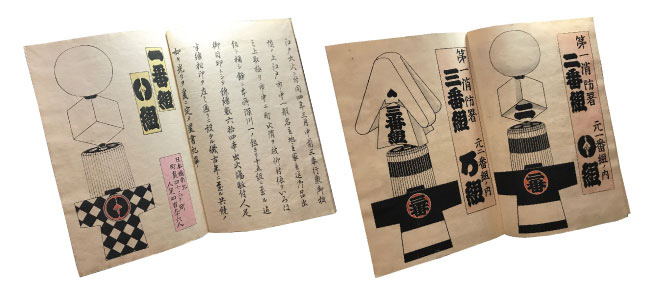
The typeface of the collar and back to distinguish between each group. I always see in the menu of typeface selection on the character palette of Photoshop or Illustrator. Even though I have not memorized installed it by myself and there are dozens of PCs in the past. It is always there but I have never used it. Something like I know the face and name, but I’ve never told the person for a long time.
But it is really great one. I thought it is difficult to read with a little space between the each lines which make the letter because I take a close look at it. Actually, this one was designed properly so that you can quickly find out where your group is at the fire site. It is better to distinguish which group is there or mine is where with the hanten, matoi or lantern. No it would be better if you can distinguish it properly from a distance.
I SEE! Yes, I naturally have no edge because I design something to have a look close such as printed matter or websites. That one I’ve cared for a long while was a chic and gallant typeface, which expresses the invisible relationship because it is close.
Oh wow I solved many years’ doubts and it was very refreshing! I feel so good to know about the typeface has proper meaning and history. Feel feel expansive!
… well, maybe today is a bit geeky?
And recently, the Edo period, which has attracted attention in terms of models and sustainability of circulating urban design, I am paying attention to the rich age when culture has blossomed. I’m interested in Ukiyoe, Kimono and chic and gallant people at that era.
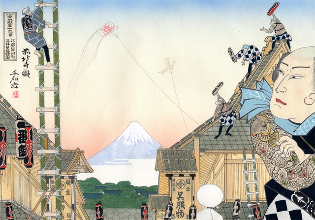
An artist Chikashi Okada’s work who taught me the firemen of Edo (from 3331)
His exhibition information
|
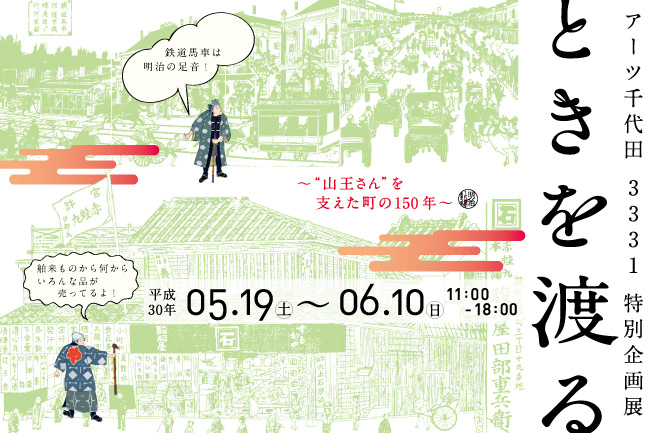
<3331 Arts Chiyoda Special Exhibition Traveling through Time – 150 Years of Carrying Sanno Festival and its Community> http://www.3331.jp/schedule/004281.html
|
|
<Chikashi Okada Exhibition If I were Hokusai> https://www.ito-ya.co.jp/store/itoya/gitoya/recommend/2018/04/002913.html
|
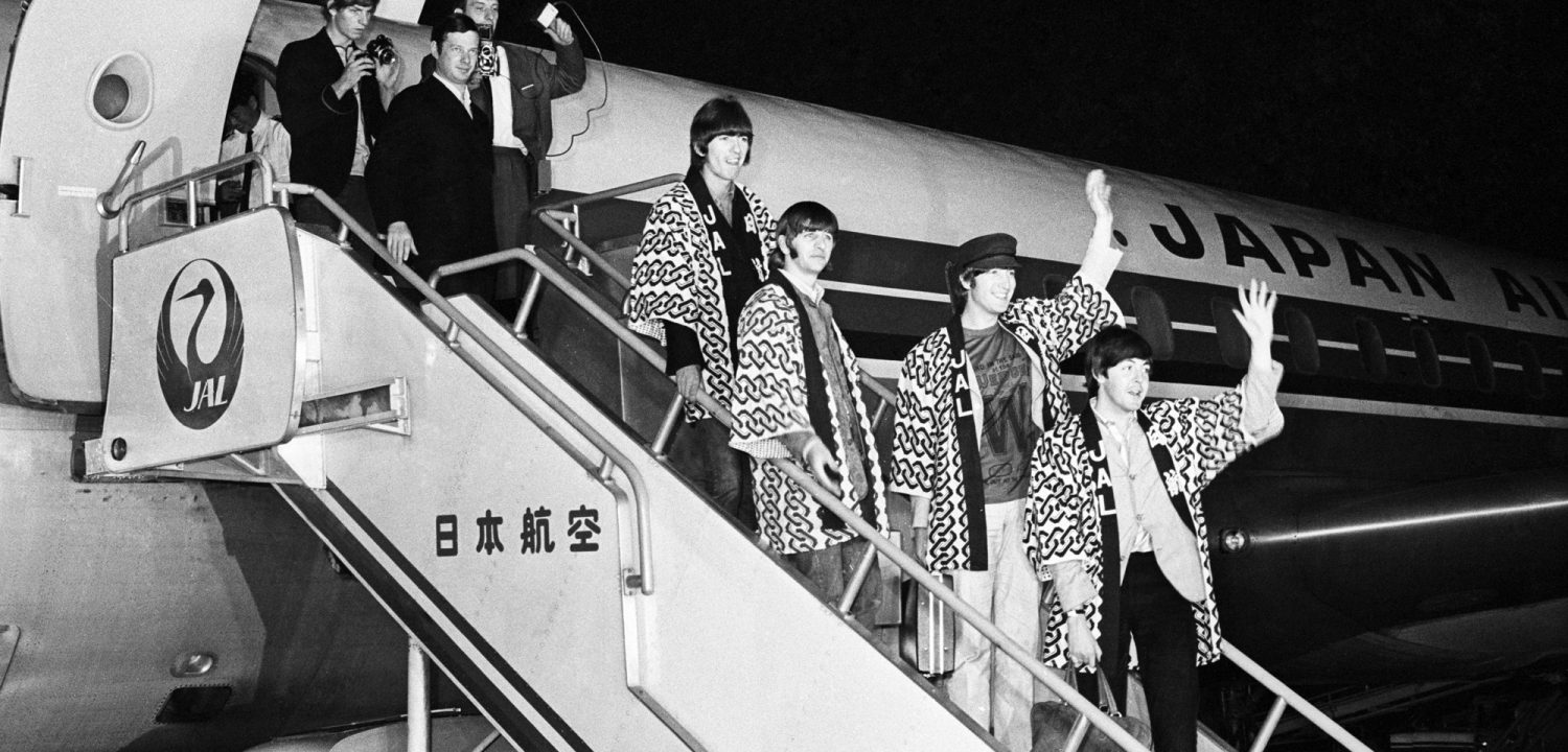
*Today’s main image is when the Beatles came to Japan, they wore Hantens with characters of JAL (Japan Airline), which meat they belonged to JAL







Leave a Comment